"I'm either way behind the bandwagon or way ahead of it." (overheard)
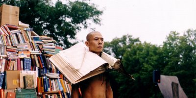
The single most arresting image in the whole fair, I think, a photograph of performance artist Zhang Huan in a scene from his piece My Boston. The jpg doesn't really do it justice. I was actually a little disappointed to find out that it was performance art and not just a brilliant photograph, but he's doing something right and I will absolutely go see him if given the opportunity.
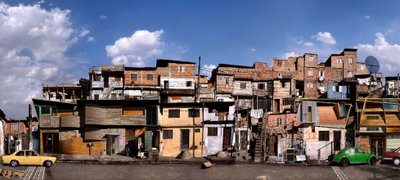
This is not the photograph by Dionisio Gonzalez that I saw, but it gives you an idea. PULSE had a piece called Santo Amaro, which showed a street of ramshackle houses in Sao Paulo. Upon closer inspection, some of the houses were ramshackle and others were modern, angular structures, which he created and added to the photograph. The sky is more interesting in Santo Amaro, that luminous yet threatening grey of a storm just beyond the picture.
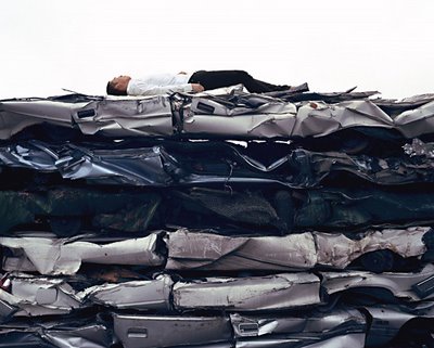
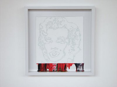
Zane Lewis, color by number paintings with all the color fallen out of the paintings. Playful and well-done. I didn't find much to laugh at in this fair, even though contemporary art can be (purposely or not) so funny. There was a trend towards larger-than-life objects made with high fidelity of unusual materials - giant boots covered in white cotton, gray felt roses nearly as tall as I am, an old-fashioned car made of cardboard, a table of painting supplies, also in cardboard.
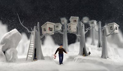
Then again, many pieces involved toys, or toy-like models created specifically for the artwork, often photographed to appear life-like, often among the more striking images at the fair. My favorite of these were unsettling yet fascinating snowglobes by Walter Martin and Paloma Munoz, dark or simply off-kilter scenes taking place in gentle snowy landscapes.
Indulging my interest in rethinking fairytales, Rachel Selekman had a large plush pumpkin purse, sitting on the floor with a delicate high-heeled shoe chained to it. Hanging above it, a separate piece, I think, an oversized green object that was sort of a purse, sort of a plant, sort of a watering can, suggestive in a sneaky way.
 Again, this isn't the exact painting by William Steiger that I saw at PULSE, but it's the closest I can find. His website displays many of his paintings, which are clean images of the geometry of buildings, amusement park rides, landscapes. The piece I saw was a view from an odd, underneath angle of a ferris wheel. At first it just looked like a jumble of green lines, an abstract work, and then shaded in areas, the seats, became visible. There were a lot of images of amusement parks, rollercoasters, ferris wheels, by many different artists at this fair. What does that mean?
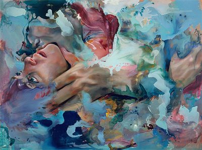
Angela Fraleigh's paintings are gorgeous - bold, sexy, a little bit violent, beautiful. This is similar to the one shown at PULSE. I would take one of these over any of the ubiquitous paintings made with big globs of textured, fluorescent paint that are just doing nothing.
Frank Breuer - containers and poles - and Farm Forms Portfolio by Jeff Brouws go together I think, simple, clean photographs of places, neither nostalgic and romanticizing nor self-consciously ugly, neither a condemnation nor endorsement of the changes to the landscape.
Mark Flood, The Demon, a painting in gold and blue of a torn piece of fabric - is the demon created by the shape of the fabric, or is this all the demon left behind?
Mary Mattingly's strange, disturbing, sometimes Dali-esque photographs commenting on nature & technology. Among the best combinations of meaning and image in the show.
That's all.


0 Comments:
Post a Comment
<< Home